Intelligent Design. We all know the words, but what do they really mean? The Net is full of posts that claim to divulge the secrets to intelligent design, but to put it in a straightforward manner, there aren’t any ‘secrets’. There are just principles.
This is a post about those principles. We at Code Brew labs take design pretty seriously, and have a dedicated extension named Allurive that is a testament to this fact. Design is not just about fine tuning the details for those with OCD – it’s about creating the ultimate user experience.
For most, ‘ultimate’ is often something that is full of complications and lofty goals. But more often than not, it’s about studying the human psyche through one’s own eyes. The rest is simply application.
Humans have a fine line when it comes to paying attention.
So where do you make the user look? Here, empathy is key. When you swipe right and left through the myriad world of apps, there are some interfaces that you end up liking – without giving enough thought as to ‘why’. Well, it is the designer’s job to think about it and we’re here to tell you what might just work.

The UI/UX designer has to be mindful when it comes to site design and eyeball grabbing, especially when company’s income may be dictated by people who visit the site and need to press one single button to get onto a profitable call.
A potential client may just go over to another site because you couldn’t keep them engaged – the world is at their fingertips, and time isn’t a luxury everyone has. The creative side and the technical side can get carried away, especially if a skilled designer can execute every whim and fantasy.
Crowding the site with heavily visual elements and a slow loading page – or your app that tasks the processor of the smartphone is a big no-no. If your app or website are full of potential things that grab their attention, you risk dividing it.
Thus, one of the first things that you need to do is to know how to preserve the Economy of Vision.
Consumer decisions require viewing displays with several alternatives and then rapidly choosing one. When you scroll through Zomato for a quick meal, your mind is processing pretty fast – and you don’t want to feed it even more information than needed.

When you think about the kind of process that goes into choosing the right meal, your brain can be capable of quite a convoluted mechanism.
Of course, understanding a little bit about how the mind works when it makes these decisions is crucial – this is where psychology comes in. Another field that helps is the science of beauty – or aesthetics. Of course, all designers cannot be accomplished psychologists by profession – so a little research can go a long way!
Drill this fact into your head – the User comes first. This may seem like every other marketing gimmick, but the designer has to understand that he/she is making a product, or a site targeting others – and not always the self.
Personalization, comfort, ease and ingenuity – all of these are generally appreciated by the human brain, especially when it has to make split second decisions and the design lays its out for them.
Speculating about the user’s wants and needs in this case can be harmful without said research. Personalization CANNOT occur without you knowing the person.
The economy of vision here helps because you don’t need to take a lot of variables into account when you’re doing research.
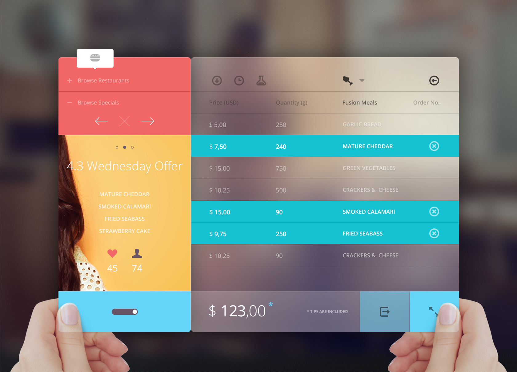
If it’s an app or a website, the landing page needs to be your guiding principle. It needs to introduce your idea as concisely as possible, and make people want to explore more – you cannot throw everything on the first page, or the opening screen. A trailer is never the movie, or ideally, it shouldn’t be.
If your concept and idea are complicated and beautiful – it’s all good, but the user should not have to crunch concepts and apply them to situations if you’ve taken care of that for them!
So, Predictability is good for people who are accessing your stuff in transit, or for a moment in their busy days. If your site cues people in, using guiding language and illustrative visuals, it’s doing a good job.
If the app can be operated almost intuitively, you’re on the right track. Things that need to be clicked on, should look like they can be. Experiment with typefaces, but don’t go overboard – more than two or three don’t work unless you’re selling fonts.
Information also needs to seamlessly flow from one point to another – how you arrange information is very important.
One needs to make websites more intuitive for users, easier to understand and navigate, and ultimately better places to spend our time as we increasingly move into an online world.
A lot of people go into wacky dimensions when it comes to virtual design. But remember, people like things that they can relate to, or have experienced. So if your font is reflected, like in the water – then it’s better than having some intergalactic floating stuff. If something looks heavy, it should feel heavy too – the font and the site’s ‘feel’ should be associated with stuff in real life.
Physics matters.
Make it easy for the user as you journey them through your product or service, is the bottom line. Use design that enables this.
Fitt’s Law is an interesting concept to explore when you’re looking at clickables. All it says is: The the closer the target is, or the bigger the target is, the quicker a consumer may make their move. This is especially relevant in online interactions, where pointing and clicking are navigational tools.

Many people misread this law as: the bigger, the better. This is incorrect – what it really refers to is that it needs to be as big as the dimensions humans can process, and feel like touching – for example, making things the size of the fingerpad bring a comfort instead of an ugly big, obvious red button.
Scaling your ‘clickables’ according to different screen sizes thus becomes immensely important here.
Of course, when we discuss intelligent design, we have to talk colors.
Colors have known to elicit strong emotions for a long time now. Many colors, many emotions can be the equation when design is concerned. However, do not confuse your consumers. Don’t throw them off the edge by splattering colors on your page, or app interface.
Instead, focus on creating an overall emotional mood the people can relate to when they think of your product. It can be warm-hearted, powerful and professional, whimsical, peppy, mysterious and elusive – or anything – but they shouldn’t feel ambivalence, or unsure.
A basic knowledge of the color wheel and dedicated emotions can help you decide what you want to use – make them green with envy, or flushed red with excitement, your call.
Other great ways of using color are contrasting, complementing the right colors and making certain shades vibrant to draw someone’s eye.
To round off this post with some other fun stuff, we bring a few ideas that psychology – particularly gestalt psychology outlines when it comes to design.
Similarity: Humans associate by comparison. People’s idea of a bomb is often to do with how a bomb looks on TV rather than what it MAY look like. Use this to your advantage, creating mini-environments on your screen.
Grouping: Even if you group two objects that aren’t similar – with something as arbitrary as a boundary around them – they appear to be. Cluster things appropriately with this knowledge, and show users what you want them to see.
Closure: When you provide a nearly complete image, people will fill in the parts themselves, automatically. Let your customers make the right inferences by using this to your advantage.
Continuation: Even if two objects are different and aligned in an ingenious manner, the eye simply overlooks differences and continues Guide people through your app or webpage that facilitates this principle.
There’re a great many principles of aesthetics and design that can be discussed within the ambit of this subject – but a blog post is hardly ever enough. I encourage you to study these and some other concepts in detail to get an eye for revolutionary design – UI/UX is not merely a mechanical task, but a very creative and strategic one.
We talked about Allurive in the beginning – the dedicated offering for giving our apps the edge they need when it comes to intelligent design.
Of course, this Blogpost is by no means the extent of our knowledge when it comes to intelligent design. Our dedicated team at Allurive brings all this to the table, and more – which is why we’re able to discuss this in the simplest way possible at the moment.
We believe in functional beauty, simple yet breathtaking design, and a purpose based design offering – but don’t take our words at face value. If this post interested you, then you can come check out our work and see if you like something there!


 Contact Us
Team Up With Us Today For An Unforgettable Service Experience


 Book Free Consultation