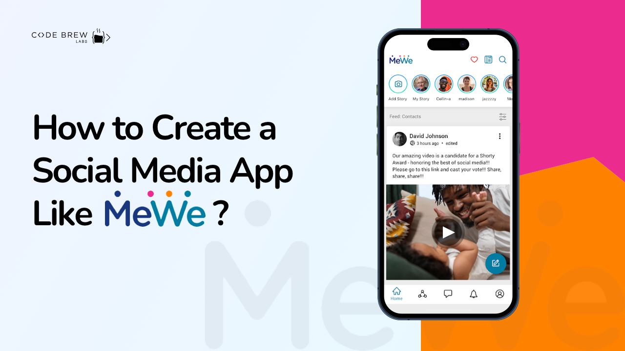
There’s an app for that. You’ve probably heard the cliche many times by now. It just goes to highlight the popularity of mobile apps in the modern world. Apps are submitted to the PlayStore and AppStore in their tens of thousands. Although more than half of them are rejected, it doesn’t undermine the real sensation they’ve created both in everyday life and the businesses around the globe.
Table of Content
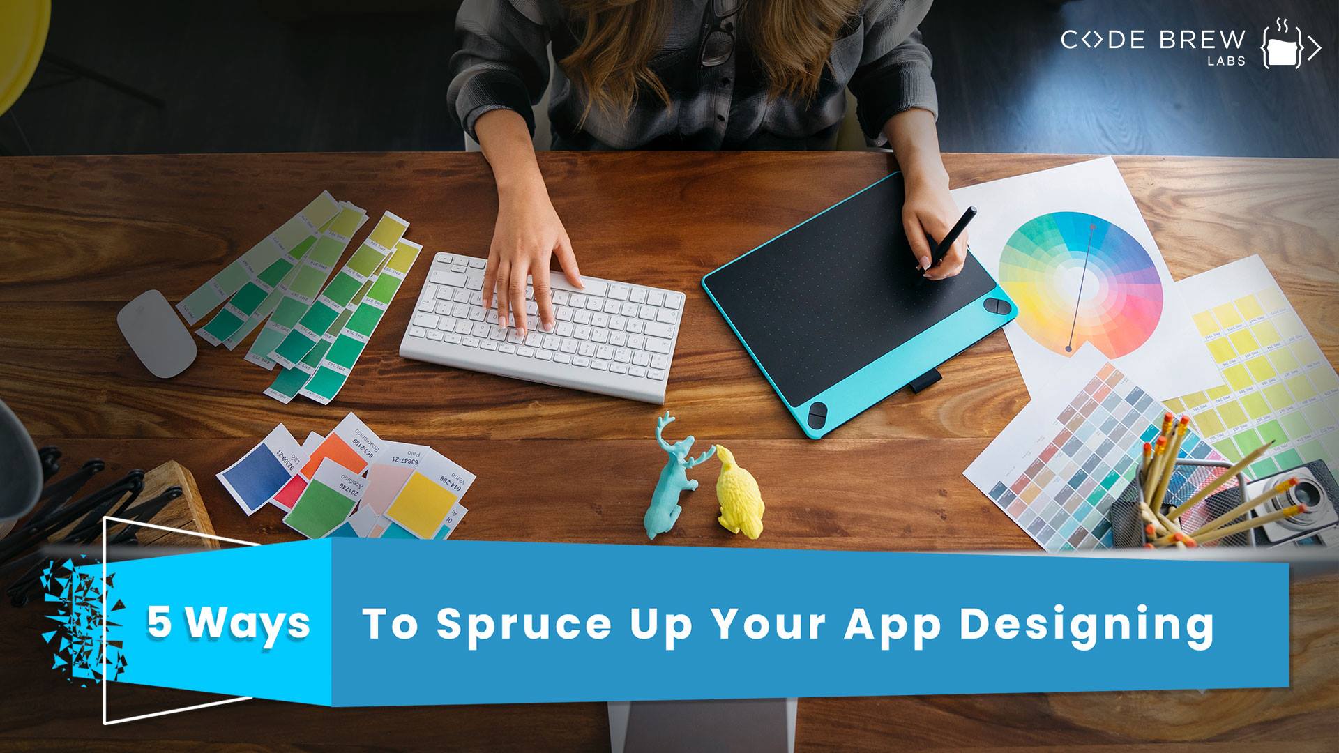
While we’re all fascinated by the utility of mobile apps, very few of us stop to give a thought as to what goes behind the scenes in mobile app development. Well, it’s a long and complex process with a great deal of analysis and logical application. The brainwork aside, most of the apps fail in the market simply because of their poor designs. The app market these days is totally user-oriented and UX of an application plays a key role in making it successful. But designing the interface isn’t that straightforward given the amount of analysis and a plethora of guidelines that need to be followed in the process. But this blog will make your job easy if you’re about to kickstart a UX project. Learn about the 5 game-changing ideas that can give your app an edge in the market.
It’s true that in the case of mobile apps, the screen size is small to design the UX. However, the established rules of interaction design still apply. Basically, the interactive design is there to allow for a neat and clean app design that’s pleasing to the end user. To achieve that, you have to keep the following points in mind:
Goal-driven designs that facilitate a quick search for the user.
Allowing usability to grab user attention.
Making an accurate use of Affordance and signifiers.
Visiting the feedback and responses to further improve the designs in the future.
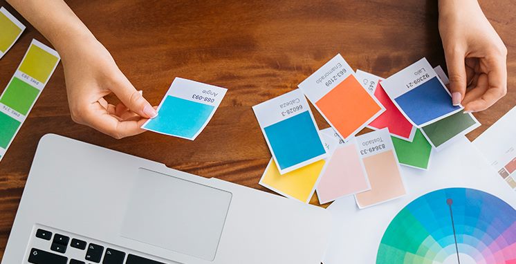
Right off the bat, you have to get the choice of colors right as it affects the whole layout of your applications. It depends on a lot of factors viz. app category, target audience, platforms among others. Of late, the use of attractive colors seems to have gone out of fashion and there’s a shift towards the use of palettes. Also, the use of white along with high contrasting colors is also gaining some currency to attract the customers. As with most of the other aspects of app development, the color selection should be made from the user’s point of view and with a thorough understanding of their preferences.
The text, without doubt, is a key part of your app design, which really gets your message across to the users. To make the maximum impact and achieve effective writing, you need to watch out for these two – your audience’s taste and choice of platforms. Get them right and you’re more likely to experience success. When you have a clear understanding of your target audience and their habits, then it helps you come up with some really engaging content. Promoting that content on the platform where your audience is known to spend a great deal of time will ensure your message hits the mark.
How often do we accidentally hit the wrong button on our smartphones and end up with a screen that wasn’t intended in the first place? Nothing frustrates the user more than finding the finger size a lot bigger in comparison to the size of the buttons displayed on the screen. The average size of a persons’ finger is 45-47 pixels. That’s quite bigger than the guidelines provided to design the button. Apple recommends the size 44. Not bad, huh? Overall, the designer should take into consideration the various manners in which a user might hold their smart devices. One thumb, one hand, two hands, one finger or two hands/two thumbs. Consider all the possibilities to come up with the ideal design.

It’s no surprise that the most successful apps can be found following the same standard set of patterns for the users. There’s no point in reinventing the wheel by playing around with additional features. Smartphone users are quite used to these patterns in every app and if they find something out of kilter in your app, they’re going to be quite hesitant about using it. Eventually, such a decision can backfire heavily and you’ll end up losing a lot of sales. Gestures, such as swiping clicking or pressing with a single click, graphics, colors and rest of it, should all be very universal, thereby allowing users to understand and use everything without much thought.
For instance, the red colors are a perfect choice for the warning text, a symbol of an envelope for the mail, the gear wheel for the settings. These are all universal symbols understood by most people around the world.
A mobile app UX is a means to represent your app to the end user. Get it wrong, your app is set to be a flop. But get it right, and your app can become the cream of the App Stores. Hope you enjoyed reading the blog. Let us know if you have any other app designing tips in addition to the ones highlighted in the blog.


 Contact Us
Team Up With Us Today For An Unforgettable Service Experience


 Book Free Consultation