The realm of designing is always in a constant state of flux. New styles, techniques, and approach are all the time experimented and employed to create awe-inspiring effects. That seems to be the case with Mobile App UI Designing for sure. If you’re a novice designer trying to find your feet in the designing arena then the various tools, terms, and conventions that are tossed about in designing spheres might leave you disconcerted.
Table of Content
But as with anything, there’s always a place, to begin with. If we analyze the various UI Design trends and innovations in the last few years, we stand in a good place to make some predictions about what’s to follow next. Well, this blog does all the hard work for you in terms of the research and analysis and brings to you the trends you want to be focusing on. I’ve highlighted 5 trends that I feel are going to dominate the UI Designing. So if you’re a designer, get ready to flex your creative muscle in these trends:
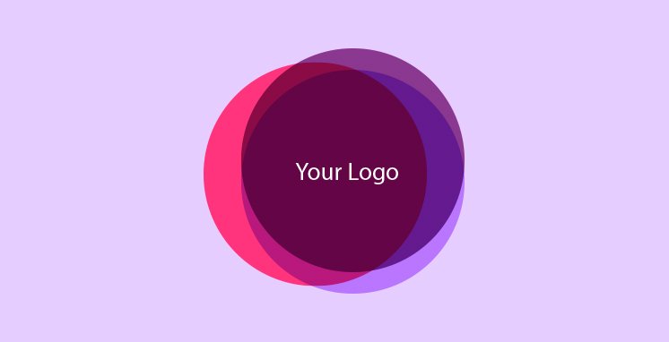
The overlapping of various design element viz. fonts, graphics, and colors not only makes for some stunning UI Designs but also creates an illusion of space. That’s mainly the reason why overlapping of different mobile app UI design elements has come into vogue in recent years.
In many cases, the overlapping of same elements clubbed with shadows render a dramatic and sensational touch to the whole mobile app interface design. For all such reasons, it’s fair to say that overlapping of various elements in mobile app UX design is going to be a hot trend for some time.
In recent years, we’ve seen a lot of designers opt for color gradients in their design work, particularly when it comes to designing logos, buttons, and backgrounds for app interfaces. So, what’s the explanation for that? Well, there’s no mystical theory to it. Once you’ve selected a color, you can demonstrate some color hierarchy and create a stunning picture by simply combining it with color gradients and other graphics. I think this trend of color gradients is here to stay for a while.
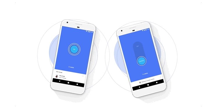
Transparency can work wonders on various components in bringing about some unexpected effects. So it’s no surprise to see designers play around with transparency a lot when designing app interfaces just to create that visually appealing design work.
But, there’s more to transparency. The various settings on different colors and graphics can be used to render a colorful glass gesture for app UI components. That’s also the reason why designers opt for this method in logo designs.
So, if you’ve just started the art of adding opacity effect to UI designs, there’s good reason to continue doing that. Setting transparency to different types of components is a trend that’s likely to carry on for a longer duration.
We seem to witnessing a comeback of minimalism in design. People find simple and natural design styles more appealing as opposed to complicated and changeable ones. This is more obvious in mobile app interfaces than probably anywhere else. For instance, in stark contrast to app interface loaded with all sorts of colors, buttons, graphics, animations, buttons and other complicated elements, the app interface consisting of simple curves, buttons and geometrics can prove to be more effective, simply because it allows people to focus on the main functions and features of a mobile app.
Some strong colors or font contrast can come in handy in creating fantastic UI design that’s visually appealing right off the bat. For instance, adding fonts in different styles, forms or sizes can deliver a semblance of hierarchy and space. Moreover, colors used in different types and styles help create sharp contrasts and making the overall design look colorful. Watch out for this trend to pick up more pace in coming time.
So those are the key trends that are going strong and should continue that way for a long, long time. Having said that, a designer must never let his/her eyes of the user needs. That’s what determines what goes mainstream. So keeping up with the latest innovations and creative artwork can go a long way in helping designers create spectacular mobile app UI designs. I hope you enjoyed reading this blog. Feel free to share your thoughts in the comment section below.


 Contact Us
Team Up With Us Today For An Unforgettable Service Experience


 Book Free Consultation